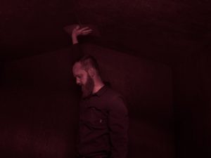
“Shelter” photographic installation by Andy Mattern

February 18 – March 21, 2019

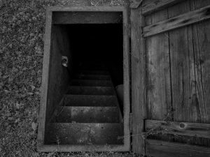
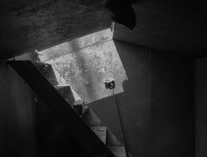
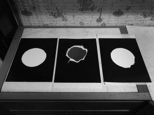
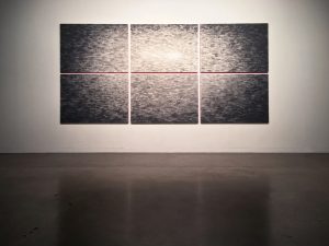
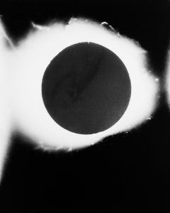
Shelter is a project visualizing time spent underground in Oklahoma storm cellars. These cool, dim spaces are both havens and tombs.  Mattern uses the cellar as a life -size camera with the air vent as the lens.  The result is an abstract arrangement of celestial circular forms mimicking these cellars that punctuate the landscape of the mid-west.

Andy Mattern utilizes unique methods of photography to create the images found in “Shelter.” The storm cellars, so prevalent in the central United States, act as Mattern’s “camera.”   Mattern uses the air vent as the camera lens; pressing light sensitive paper up to the vent allowing the only available light to filter through creating a lone image.  What emerges is a rather unusual image, a black and white abstract orb.   “It is barely even an image,” says Mattern, “yet the images capture the impression of the place, with the focus being on the interior.”


The name “Shelter” refers to the fact that this project took place inside of Oklahoma storm cellars, or storm shelters, where local people take refuge during tornadoes. In this exhibition, the photographs are intentionally scattered to mimic an aerial view of Tornado Alley in Oklahoma. This was a new experience for Mattern, one where he “felt like a tourist,” as he had never been inside of a tornado shelter before this project.  Having to go door to door asking to be let into the cellars, Mattern soon found a “welcoming environment” in this unfamiliar location.  He notes that this new, albeit scary, location allowed him to feel connected to the community around him.  Perhaps this speaks to this universal understanding of shelter, and the consolation it can bring in the most dire of circumstances.

~ Maggie Nealon, ‘20
Gallery Exhibition Research Assistant


Andy Mattern is represented by Elizabeth Houston Gallery, New York

“Variations on a Theme” sculpture and cyanotypes by Heather Beardsley

December 17, 2018 through February 7, 2019

Artist Talk/Reception: Thursday, Jan 17, 11:30am – 12:30pm

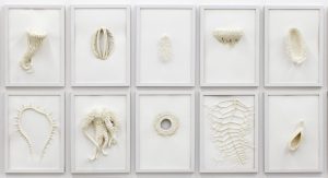
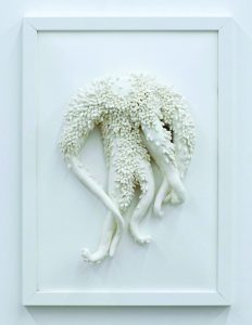
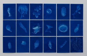
This series is inspired by Ernst Haeckel’s illustrations, lithographs and drawings that blur the lines between art and science.  In his time these prints were ubiquitous, their presentation of a natural world whose forms can be ordered, understood and, most importantly, improved upon took deep root in pre-War Western culture.  Haeckel’s firm belief that all organisms were made up of geometric crystalline structures that could be perfected through evolution caused him to exaggerate and idealize the organisms he represented. This ideological quest for perfection in the natural world went on to become an important influence on Eugenics programs that took these views to their terrible extremes.


Like previous generations, I can’t help but be fascinated by these illustrations despite my awareness of their problematic ideological foundations and history.  My work takes Haeckel’s embellishments one step further, exaggerating the stranger elements of his creations based on my own aesthetic preferences rather than scientific observation. Like Haeckel, my figures are inspired by plants, sea creatures and protists, and my unapologetic fabulation demonstrates what happens when ideology supersedes observations.  My pieces are hand-made, but I’ve used model magic coated with acrylic gel medium to intentionally resemble 3D printed models in an attempt to borrow from the aura of objectivity that envelopes scientific illustration.   Although this work is inspired by an historical example, in this time of “alternative facts” where truth seems so illusory, these questions of ideology and objectivity are just as relevant today.

“Sophisticated Chaos” watercolors by Ken Karlic

November 5 – December 7, 2018
Artist Talk:  November 15, 11:30am – 12:30pm

SOPHISTICATED CHAOS

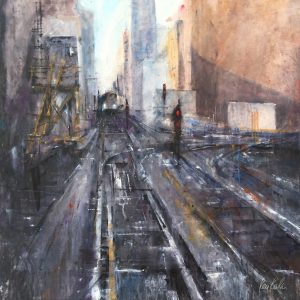
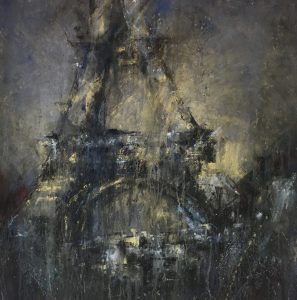
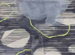
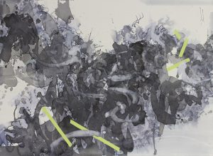
Inspired by scenes of complex forms, this exhibition of watercolor paintings uses structures as a vehicle to explore the physicality of material, technique and subject. Pushing the boundaries of watercolor, these works merge art, design and architecture which dissolve into varying levels of abstraction. The painting approach is as much a part of the work as the subject—with marks, drips and splatters all becoming part of the final piece. The results are images that are bold yet beautiful, muscular yet elegant, suggestive and evocative.

Originally from Chicago, Ken Karlic studied architecture, painting and graphic design at the University of Illinois in Urbana-Champaign and received a BFA. He is a founding partner of the Baltimore-based graphic design firm Splice Design and teaches painting workshops nationally. Ken lives and works in Bel Air, Maryland.

Ken regularly exhibits throughout the Mid-Atlantic region and participates in national juried plein air competitions including Plein Air Easton, Door County Plein Air and Cape Ann Plein Air. He has recently been featured in The Art of Watercolour, PleinAir Magazine, Fine Art Today and Voyage Chicago. In addition, Ken wrote, “Sophisticated Chaos with DANIEL SMITH Watercolors, Step by Step Painting Large Scale” for Daniel Smith Art Materials, which was distributed to their global community of professional artists, retailers and distributors.


“Spirit of the Day” sumi ink paintings by Nishiki Sugawara-Beda

October 1 – 27, 2018
Artist Talk/Reception: Thursday, October 11, 11:30am-12:30pm

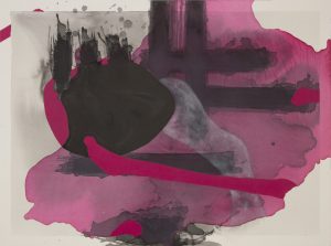
 Spirit of the Day offers viewers an essential yet often forgotten engagement—a deeper connection with their own spirit in the contemporary busy society. The paintings present a moment of this spiritual engagement through mindfully cultivated marks on the surface. Sumi-ink brings out subtle and nuanced shifts in values and highlights a myriad of layers so that viewers may lost in them and find the core of humanity.

Spirit of the Day

 “When I say ‘I am’, I am really including everyone else. We are all connected.”

– Nishiki Sugawara-Beda

Nishiki Sugawara-Beda cultivates feelings of honest connection in Spirit of the Day. Sugawara-Beda draws from Japanese culture and language, her own immigration experience, and family life to create these works. Her paintings are exercises in spiritual connection and mindfulness. The artist works in Sumi ink, a staple in Japanese calligraphy. This choice was made largely to hold fast to Japanese culture after moving to the United States. She remembers fondly the slow, laborious practice of making Sumi ink, which is done before one practices calligraphy and serves doubly as meditative preparation for the practice.

In earlier works, the artist uses Sumi ink to draw Japanese characters without picking up the brush, creating an abstract form from line and value. In time, the process evolved to create the lines and subsequent forms without drawing the characters, only by thinking of certain words and phrases.

Through this practice, Sugawara-Beda creates a medium through which she can communicate honestly with viewers. The paintings serve as an opportunity for viewers to engage meditatively with Sugawara-Beda. By getting lost in the lines, viewers see what they wish, learning about both themselves and the artist.

Spirit of the Day is on view in the Merion Hall gallery through October 27, 2018.

~ Devon D’Andrea ‘20
Gallery Exhibition Research Assistant

Inaugural & Hana
22″×30″, Sumi ink and acrylic on paper mounted on wood, 2017/2016


Inaugural, a series characterized by the color blue, was created when Sugawara-Beda became a new mother. After giving birth, the artist had to redefine herself as an artist and a person. These works explore the feelings of excitement and uncertainty associated with new motherhood while staying true to her core process. Additionally, this series is exemplary of Sugawara-Beda’s earlier works, when her process included drawing words and phrases before creating the line.


In contrast, Hana, “flower” in Japanese, did not start with written words. Instead, the artist remembered a story about a Zen teacher and his students.

“Traditionally, Zen practice is learned by question and answer between students and a teacher. One day, a teacher gathered his students, and they all stood ready to receive a question, but the teacher stood there in front of the students, holding a flower and smiling. Eventually, all of the students started to smile, too.”  – Nishiki Sugawara-Beda

For the artist, Hana serves to communicate a positive feeling. With bright pinks and plunging lines, viewers feel a sense of contented peace.


How We See It
39.5″×141″, Sumi ink and acrylic on paper mounted on wood, 2018

This piece is a whole greater than the sum of its parts. For Sugawara-Beda, it was a study in her process. It is entirely abstract, and its interpretation is meant to be fluid. Viewers should see what they want to see in the painting. The artist wishes for the piece to serve as a tool in meditation. To engage with it is to engage with oneself and all of humanity.

~ Devon D’Andrea ‘20
Gallery Exhibition Research Assistant


“Z” ambrotypes by Rowan Renee

August 20 – September 20, 2018
Artist Talk: September 20, 11:30am – 12:30pm
ALL ARE WELCOME!

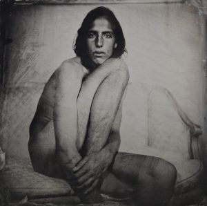
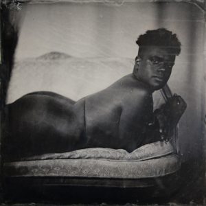
Z is a collection of nude ambrotype portraits working with transgender, cisgender, and a spectrum of genderqueer and gender non-conforming individuals. Through Z, I aim to deconstruct conventions of the nude body towards more diverse representations. The title of the collection refers to a proposed gender neutral pronoun.

Each image records a collaborative dialogue between model and photographer that develops over the course of a shoot. These conversations consider the power dynamics of the photographic gaze, the ambiguities of gender performance and embodiment, and the complex intersection of vulnerability and empowerment that arise when one’s body is read as “queer”. Through these portraits I cultivate a connection between subject and viewer that transcends the normative categories of “man” and “woman”, leaving space for the nuances of personhood that remain when these categories dissolve.

I use the 19th century Wet-Plate Collodion process with contemporary subjects as a revision to historic representations of gender non-conforming people. Gender variance has always existed, but Victorian photographers routinely medicalized and pathologized their images, perpetuating a visual violence that fragments, dehumanizes and fetishizes queer bodies. The images in Z are conceived as reparative acts,  superimposing new imagery into the gaps left by history.

The timeliness of transgender visibility in mainstream media makes Z an urgent body of work to reach a wider audience. Recent federal legislation limiting transgender Military service, and discriminatory bathroom bills passed in several cities and states, have highlighted the need for further social and legislative change to achieve full inclusion and equality. Towards this goal I channel a photographic process that creates intimacy; a powerful tool to advance a worldview that is open, malleable and accepting of diversity.

ARTIST INFO:

Name: Rowan Renee

Preferred Pronouns: They/Them

Website: http://rowanrenee.com

Instagram: @brooklyntintype

Artist Bio: Rowan Renee is a genderqueer artist whose work explores themes of gender and power. Renee has received awards from The Aaron Siskind Foundation, The Rema Hort Mann Foundation and The Anchorage Museum of Art. Previous solo exhibitions include “Z” at Pioneer Works Center for Art and Innovation (2015) and “Bodies of Wood” (2017) at The Aperture Foundation. They have received fellowships from The Jerome Foundation, the McColl Center for Visual Art and the Ossian Arts Fellowship at the Jain Family Institute. They have been profiled on NPR, in The New York Times, VICE, Hyperallergic, Huffington Post, American Photo Magazine and Guernica, among many other publications. They are currently living between Brooklyn, New York and Ann Arbor, Michigan.


“Easton Nights” photography by Peter Ydeen

August 20 – September 25, 2018

Artist Talk/Reception: September 25, 11:30am – 12:30pm
ALL ARE WELCOME

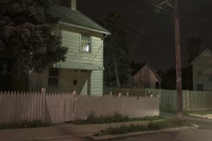
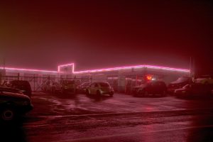
This piece, “I Want a Yellow House with a White Picket Fence” reflects on the American dream. This environment creates a type of mystical realism, similar to the environment pictured in the pieces by Charles Burchfield. Burchfield painted many townscapes, and nature scenes inspiring Ydeen. Within Ydeen’s pieces, there are not many people pictured, and he tries to focus on lighting and architectural design. So many people desire a home with a white picket fence, this abandoned looking town shows a broken idea. The light coming from the bedroom window is the only sign of life emitted from the piece. The nighttime scene isolates a specific vignette, and creates something that you could not get from daytime photography.

Peter Ydeen moved to Easton based on recommendations from a client. Although this is a medium sized city, Easton is between the major cities of New York City and Philadelphia. When he arrived into the city, Ydeen believed that the city had a sort of dislike towards humankind and avoided society in general. It seemed to be almost lost in time, and only related with the people nearby. After living in the town for a while, he realized that was not the truth. Rather, he believes that the town has a strong influence of Americana. These influences play through in many aspects of the town. From local businesses displaying American flags in their windows to the rebirth and repurpose of old town buildings. Although the commonality of Americana today is dwindling, it has become an important part of Ydeen’s work. Through his photographed materials, he created place that makes you feel you have visited this classic small town on the outskirts of two large cities. Ydeen accomplishes this by paying close attention to the lighting, and architectural layouts of Easton. The idea of taking the photos at night shows to be important in isolating the personal private spaces, and showing the importance of spatial lighting.

~ Gabriella Youshock, Gallery Exhibition Research Assistant

“Somnambulant” mixed media installation by Samantha Parker Salazar

Artist Statement

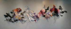
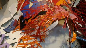
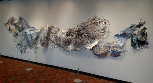
The fringe of consciousness contains countless moments of affirmation that our reality may be effectively reduced to universal shapes and forms. Such forms can be expressed through the intimate marks excavated from recklessly smeared surfaces. The edge of my scalpel blade regards each happenstance smudge and line, heightening the importance of seemingly less significant areas. Repetitively deconstructing and re-configuring a simple material gives conceptual power to the process of physical transformation. In these works, the negative and positive spaces are visual equals by allowing light and shadow to dance upon the surrounding architecture. The forms, suspended in space, are a quiet reflection on beauty, destruction, and potential.

Junior Art Majors’ Exhibition

O L I V I A   H E I S T E R K A M P

__________________________________________________________________

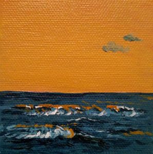
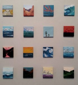
Olivia’s artwork is a series of miniature acrylic paintings and a second series of pencil and charcoal drawings. She completed her artwork in two separate classes, Painting I and II, both instructed by Professor Dennis McNally. She had the freedom to choose what she painted, which allowed her to be inspired by her peers as well as her surroundings both in and out of the classroom. Olivia’s paintings depict the seascapes and landscapes that surround her.  She describes her attraction to nature,

“I am greatly inspired by nature, and natural forms are what intrigue me most, AS opposed to rigidity. It is my default to portray landscapes/seascapes in a variety of ways. However, many of my drawings are still lifes or body parts. This mainly grew out of necessity – I am not always by the ocean or in the woods. I live in a poorly lit apartment on Lancaster Ave. That doesn’t exactly scream organic. However, it is my belief that beauty can come from anywhere and so can good art.”

You can see the inspiration from nature in all her pieces. A carefully chosen color palette of subtle blues and vivid greens evoke the natural movement of life throughout her paintings. Olivia pays close attention to detail taking care to include the smallest wave and tree branch in her paintings. She also emphasizes the horizontal with two distinct lines across the sky in two of her paintings and an emphasis on the horizon line in her landscapes and seascapes.

~ Rowan Sullivan ‘21
Gallery Exhibit Research Assistant


N I C O   T A M B O R E L L O
____________________________________________________

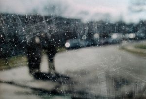
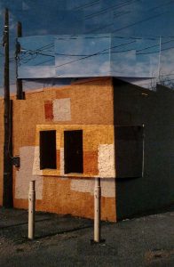
Nico’s artwork is a collection of three photo series printed on 13×19 inch Glossy + Matte Paper, taken on a digital camera and edited in Adobe Lightroom/PhotoShop. Nico created his two collections in the class “The Constructed Digital Image” instructed by Professor Krista Svalbonas. The photographs focus on light, shadow, and reflection found in urban scenes in Philadelphia. In addition, he emphasizes architecture and geometric shapes. Nico describes the differences among his three series:

“The first focuses on a person in an urban landscape and his shadow. The second is a collection of portraits of the street and found beauty. The last is more abstract, focusing on reflections, and shooting into windows to capture multiple reflections.”

Two artists have influenced Nico’s photography, Eugene Atget, “for his work focusing on shadow and reflections in Paris, which relates a lot to my work capturing shadows and reflections in Philadelphia.” He is also drawn to the work of Alfred Stieglitz “for his documentary-esque photography of the world around him.” You can see the influence of these artists mixed with Nico’s individual style in his use of light and shadow, where the flat planes and sharp angles intersect with soft shadows and subtle light, creating complex and abstract images.

~ Rowan Sullivan ‘21
Gallery Exhibit Research Assistant


J U L I A   D O N A H U E
____________________________________________________

Julia’s work showcases a variety of mediums, including color and black and white photography, ceramics and mixed media collage.

She completed her collections of photography in “Digital Photography I” instructed by Professor Mary Rhodomoyer and “The Constructed Digital Image” instructed by Professor Krista Svalbonas.

Julia has two collections of photographs, one titled “The Streets of Philadelphia,” which highlights the beauty of Philadelphia. She describes her inspiration for this collection saying,

“This is Philadelphia’s year. The Eagles won the Super Bowl, Villanova won the National Championship for basketball and that’s just two examples of how the underdogs came through. I was inspired by the city of Philadelphia for some of my work. I tried to show just a piece of how beautiful Philly really is.”

Her 8×10 inch charcoal drawing of Carson Wentz and head coach Doug Peterson doing a fist pump was inspired by the city of Philadelphia. Julia says of this drawing, “I wanted to show the unity of Philadelphia and how we really are the City of Brotherly Love.”

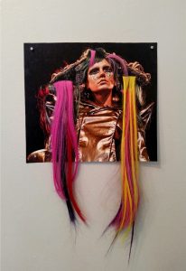
The other collection of colored photographs printed on regular matte and glossy paper are of the New York City Hair Show. These pictures focus on the model’s elaborate hairdos and the artistic ability of hair stylists. Julia describes her inspiration for these prints:

“I was inspired by my mother. She is a hair stylist. She took me to the New York City hair show and I was in awe of what my mother and other hair stylists can do.”

In one of these photos Julia weaves fake hair through the photograph in order to create a 3D effect. This artistic addition to the photograph adds her own stylistic twist to the collection of photographs and accentuates the intricate detail and extravagant hairstyle pictured in the image.

Julia created her 13×22 inch self-portrait by printing a photograph onto fabric, and then sewing the lyrics of the Beatles song “Julia” which she was named after, into the background with black thread. The self-portrait is Julia’s personal favorite work on display and says that the portrait is a piece that really speaks from her heart and shows people a little part of who she is.

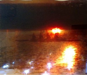
On the second floor is a series of photo representations on eight pieces of glass picturing rowers on Kelly Drive as the sun is going down. Julia created this piece in the spirit of Philadelphia’s beauty. She was also inspired by the artist, Nobuhiro Nakanishi, who prints photographs of landscapes or sunsets on..glass..panels.
~ Rowan Sullivan ‘21
Gallery Exhibit Research Assistant

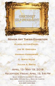
Senior Art Majors’ Thesis Exhibition

E L I A N A   A C T O R – E N G E L
__________________________________________________________

This collection of hand-built sculpture and pottery is an exhibition of vulnerability and complex hope. Personally, I have always been able to rationalize and cope with pain through the artistic process, in particular via its facets of self-exploration, expression, and even beauty. I decided to expand the scope of my project using a survey I devised, with a special interest in seeing how my responses to certain questions differ and align with those of others in the queer community. I disseminated my survey to my queer community and encouraged them to be open and honest; the bowls and sculptures each feature language taken from (and often reworded for clarity) their responses to the following questions:
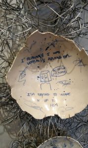
If you could acquire any quality that you admire — whether it be mental, spiritual, or emotional — what would it be?

Has fear ever stopped you from doing something you wanted to? Describe a time this may have happened.

What is something you haven’t forgiven yourself for?

What are you holding on to that you want to let go of?
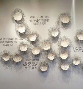
Though the answers vary, recurring themes of safety, anxiety, trauma, abuse, and gender dysphoria appear abundantly, suggesting their pre valence in the queer community.

The visual approach to this project is equally important as the messages scrawled across each form’s surface. Each piece adheres somewhat to the traditional aesthetics of Japanese ceramics, making use of porcelain and cobalt surfaces. Additionally, the technique used to repair some of the plates that broke during the firing is the Japanese process of Kintsugi, or to repair with gold. This further suggests to the viewer that simply because something appears broken at first glance, it may be able to be healed in a way that leaves it more precious than before. My theory is that the same is often true of people, in that a sense of brokenness in a person does not decrease their value and that vulnerability can be used to combat the fears that caused the breaks themselves. My experience both in physically creating these works of art and answering the survey have shown me the power of being unapologetically honest with the self in order to dispel the shame and guilt that surrounds fear.


J O E   W.   G R E V E R A __________________________________________________________

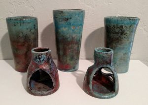
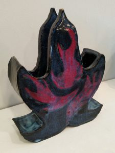
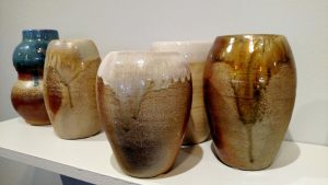
My sculptural work involves the mending of visual organization with pottery. With my wheel-thrown and large coil-built vessels, I take the traditional view of “pottery as replication” to another level by arranging different—but similar—forms around each other. Hopefully, this challenges how the visual impact of a group (of similar objects) may affect our perception of an individual object(s)—at what point does the group become the unit? I try to personify my pieces by subjecting them to alternative firing methods, allowing fire to do what it will with each piece. “Raku” is an ancient Japanese method of firing a clay piece until it is red hot, then taking it out of the kiln and submerging it into a container of combustibles to “reduce” in an oxygen-starved environment. A unique and unpredictable coloring is formed by the reaction of copper in the glazes. In a similar reducing process, I’ve used a wood fire kiln to allow the ash and heat to imprint on each piece. The beauty these firing methods are very recognizable yet nearly impossible to replicate.
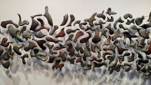
With the large vases, I start by cutting one shape and then additional shapes that are reacting to each other. Once the cut pieces are physically removed, the “mother” vase appears to have lost its purpose and integrity. The cut pieces, or “kids”, are then meticulously refined and raku-fired. Just as with the original vase, each piece influences the next until they fit together. Although the “mothers” may have beauty, the “kids” grow to create something far greater.

Through these arrangements I invite a viewer to pass slowly—especially along the wall piece—to observe the alignments and misalignments, to enjoy the individual pieces, the spaces between and around them, and the arrangement as a whole. We are all unique and when we forget that, we get lost in a crowd.
 

H A N N A H   K E R K E R I N G
__________________________________________________________

I strive to make all my work simplistic, eye-catching, and powerful, and at the same time visually attractive. I start with a goal of what I want to accomplish, although I don’t always know how I’m going to get there. I always try to put myself in my work as much as possible by incorporating my personal style as well as my opinions and past experiences.
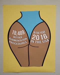
In this series, I want people to start analyzing and discussing social media, and how it often causes women to take drastic measures in order to achieve the “perfect body”. Influenced by the things and people I see every day on social media, I gather pictures of the most common unhealthy beauty habits and use these pictures as a stencil for my illustrations. The images are unrealistic and appear unfinished in order to reiterate how these bodies, as portrayed on social media, are unnatural and unrealistic.
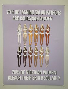
With this body of work, I am encouraging people, especially young women, to consider why they feel they need to change their appearance. Poor body image among women is nothing new. However, the shocking statistics combined with the familiar imagery should provoke dialogue.


C.  S O F I A   N A A B
__________________________________________________________

My art medium is cross stitch. Cross stitch is a craft, where I sew stitches in the form of X’s. I started learning to sew when I was very little. My abuelita, (grandmother) taught me, and introduced me to a craft that isn’t done as often as it was in the old days, when women did embroidery as a pastime. By the time I was in high school, I became so obsessed with the craft that it was suggested that I do projects from my own pictures, but I didn’t actually start doing it until last year. I found the tools that allow me to upload a picture, pixelate it, and decide how big I want the finished piece to be, thereby converting the image into a pattern. The challenge is in the precision of the stitches; I manage this by marking the back of cloth every ten stitches, which is how the pattern is gridded: small squares separated by a bold line every 10 x 10 stitches.
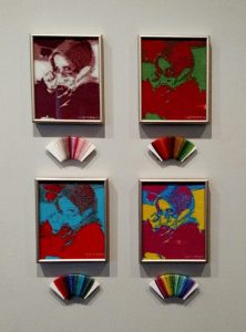
Most artists create work that shows an emotional interpretation of a subject. My work doesn’t give me any sense of emotion; rather, it’s an experimental process that combines contemporary photography with an outdated craft. When I started this project, I wasn’t thinking about what I was going to do, I just wanted to finally try something of my own design. I’m an individual with a mild form of autism, therefore, I often display a repetitive behavior; sewing is a craft with a repetitive motion, so when I do it I’m not thinking about how the project is going to turn out (I have those thoughts when I’m creating the pattern). Once I have a pattern to guide me, the finished product is already mapped out on the fabric, so to speak, and I think I can concentrate on bringing it to life. I thought this would be an appropriate “Senior Project” as I like the idea of creating something that most people haven’t seen before.


J U L I A N   A.   S M I T H
__________________________________________________________

When making my work I seek to create a space that the viewer can project themselves into and explore. The spaces take on the form of fantastical and alien landscapes, but each begins with an individual object from which I expand and build; much like a conversation.

The initial object is an abstraction of an emotion or experience. Often they spring from my struggles with mental illness, specifically depression. I then translate the emotion or experience into a physical object which seeks to convey something that is central to the subject. For example, containment and enclosure are common themes that I visit when exploring my mental illness.
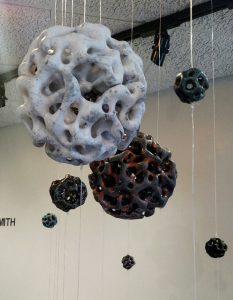
Once the initial object is complete I begin to react and respond to it much as you would follow a line of thinking. I have a conversation with the objects I build and attempt to piece them together like an argument; putting in new ideas when I have them, and taking out ones that don’t work. Eventually, I end up with a landscape of objects that has sprung from a single emotion or experience, much like an argument springs from a single thought.

The spaces are meant to function as places to escape to, but also as spaces that encourage reflection and introspection. Hopefully, the abstract nature of these spaces allows the viewer to step outside the boundaries they unconsciously set for themselves, and explore ideas in a way they might not have let themselves before.

I find it is important to step back and look at things in a new way. Whether they be brand new, or familiar issues. Sticking to our entrenched ways of thinking leads us nowhere and does us, and our communities, a disservice. If we are to grow as a community we will need to step outside our habitual ways of thinking and explore new and potentially uncomfortable ideas.
Student Ceramics Exhibition

Student Ceramics Exhibition
by Devon D’Andrea ‘20, Gallery Exhibition Research Assistant


Kristin Skeuse ’18

Ceramics is an art form dating back to prehistoric times that involves heating and cooling an inorganic solid to create a desired shape. Ceramic vessels have been used functionally and decoratively by almost every culture in the world. This medium is noted for its demand of patience, craftsmanship, and artistry.

Led by Jill Allen, the Advanced Ceramics students offer pieces that express accomplished freedom and personality. Neil Patterson guided Ceramics I students in learning the foundation of ceramics, with pieces displaying a full understanding of shape, texture, and balance.

These works are by art majors and minors, as well as by  work from students who double major or major in disciplines other than art. Although there is no common theme among the pieces exhibited, Allen and Patterson both feel that both the beginner and advanced compositions display the students’ hard work and personal artistry. The variety and diversity of the work these students have produced is a representsation of the diversity of the students’ approaches .

Joseph Grevera, Class of 2018

The pieces Joe, a  major, included in this show are representative of trial and error, and he considers them to be works that he feels are personal success stories. Much of his current work revolves around exploring a certain process, with the final product being more representative of the process than of the form itself. One of his works, a set of three vessels, was created using traditional Raku firing techniques, and are displayed in order according to the length of firing time, the shortest being the most copper in tone, and the longest being the bluest the longest.
Alexandra Herrera, Class of 2018


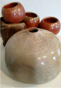
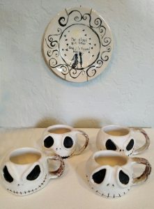
In creating the set of sake cups and an accompanying sake jar, Alexandra, a  major, was inspired by a traditional sake set her grandmother gave her, as well as a trip to Japan when she was a child. The sake jar is rounded and natural, a personal take on traditional cylindrical sake jars. Similarly, the set of Nightmare Before Christmas themed cups and Corpse Bride plate are reminiscent of the movies she loved growing up. All of Alexandra’s works were created all of her works using a non-traditional process, looking at the design process as a culmination of multiple techniques to perfectly represent her vision.

Christopher Stevens, Class of 2018

Christopher, a senior Biology major, floored instructor Neil Patterson with his enthusiasm and talent. One of his pieces, inspired by Avatar: The Last Airbender is a vase meant to replicate an artifact from The Fire Nation, a fictional culture from the show, while employing fundamental pottery techniques.


https://sites.sju.edu/art/

https://www.instagram.com/sjugallery/

https://twitter.com/SJUGallery